时间序列#
import matplotlib as mpl
import matplotlib.pyplot as plt
import numpy as np
import pandas as pd
from dateutil.parser import parse
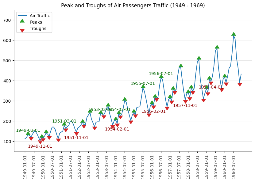
Peaks#
passengers = pd.read_csv("data/air_passengers.csv")
passengers.head()
| date | value | |
|---|---|---|
| 0 | 1949-01-01 | 112 |
| 1 | 1949-02-01 | 118 |
| 2 | 1949-03-01 | 132 |
| 3 | 1949-04-01 | 129 |
| 4 | 1949-05-01 | 121 |
traffic = passengers.value
doubled_iff = np.diff(np.sign(np.diff(traffic)))
peak_locations = np.where(doubled_iff == -2)[0] + 1

doubled_iff2 = np.diff(np.sign(np.diff(-1 * traffic)))
trough_locations = np.where(doubled_iff2 == -2)[0] + 1
_, ax = plt.subplots(figsize=(10, 6))

ax.plot("date", "value", data=passengers, color="tab:blue", label="Air Traffic")

ax.scatter(
    passengers.date[peak_locations],
    passengers.value[peak_locations],
    marker=mpl.markers.CARETUPBASE,
    color="tab:green",
    s=100,
    label="Peaks",
)

ax.scatter(
    passengers.date[trough_locations],
    passengers.value[trough_locations],
    marker=mpl.markers.CARETDOWNBASE,
    color="tab:red",
    s=100,
    label="Troughs",
)

for t, p in zip(trough_locations[1::5], peak_locations[::3]):
    ax.text(
        passengers.date[p],
        passengers.value[p] + 15,
        passengers.date[p],
        horizontalalignment="center",
        color="darkgreen",
    )

    ax.text(
        passengers.date[t],
        passengers.value[t] - 35,
        passengers.date[t],
        horizontalalignment="center",
        color="darkred",
    )

xtick_location = passengers.index.tolist()[::6]
xtick_labels = passengers.date.tolist()[::6]
ytick_labels = passengers.value.tolist()[::6]

ax.set(ylim=(50, 750))
ax.set_xticks(ticks=xtick_location)
ax.set_xticklabels(labels=xtick_labels, rotation=90, alpha=0.7)
ax.set(title="Peak and Troughs of Air Passengers Traffic (1949 - 1969)")

ax.spines["top"].set_alpha(0.0)
ax.spines["bottom"].set_alpha(0.3)
ax.spines["right"].set_alpha(0.0)
ax.spines["left"].set_alpha(0.3)

ax.legend(loc="upper left")
ax.grid(axis="y", alpha=0.3)
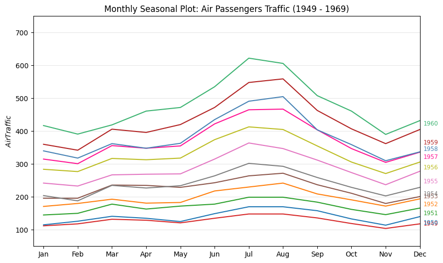
Seasonal#
passengers["year"] = [parse(d).year for d in passengers.date]
passengers["month"] = [parse(d).strftime("%b") for d in passengers.date]
years = passengers["year"].unique()

mycolors = [
    "tab:red",
    "tab:blue",
    "tab:green",
    "tab:orange",
    "tab:brown",
    "tab:grey",
    "tab:pink",
    "tab:olive",
    "deeppink",
    "steelblue",
    "firebrick",
    "mediumseagreen",
]

_, ax = plt.subplots(figsize=(10, 6))

for i, y in enumerate(years):
    ax.plot(
        "month",
        "value",
        data=passengers.query(f"year=={y}"),
        color=mycolors[i],
        label=y,
    )
    ax.text(
        passengers.query(f"year=={y}").shape[0] - 0.9,
        passengers.query(f"year=={y}")["value"].loc[-1:].array[0],
        y,
        fontsize="small",
        color=mycolors[i],
    )

ax.set(
    xlim=(-0.3, 11),
    ylim=(50, 750),
    ylabel="$Air Traffic$",
    title="Monthly Seasonal Plot: Air Passengers Traffic (1949 - 1969)",
)

ax.grid(axis="y", alpha=0.3)
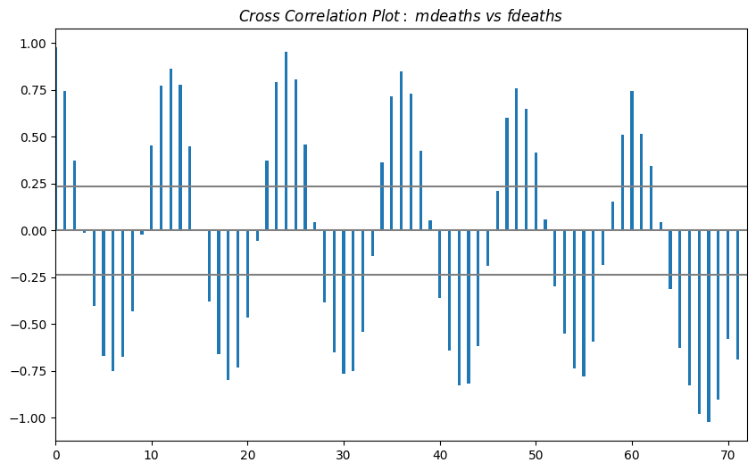
Cross Correlation#
from statsmodels.tsa import stattools
mortality = pd.read_csv("data/mortality.csv")
mortality.head()
| date | mdeaths | fdeaths | |
|---|---|---|---|
| 0 | Jan 1974 | 2134 | 901 |
| 1 | Feb 1974 | 1863 | 689 |
| 2 | Mar 1974 | 1877 | 827 |
| 3 | Apr 1974 | 1877 | 677 |
| 4 | May 1974 | 1492 | 522 |
x = mortality["mdeaths"]
y = mortality["fdeaths"]

ccs = stattools.ccf(x, y)[:100]
nlags = len(ccs)

conf_level = 2 / np.sqrt(nlags)

_, ax = plt.subplots(figsize=(10, 6))

ax.hlines(0, xmin=0, xmax=100, color="gray")
ax.hlines(conf_level, xmin=0, xmax=100, color="gray")
ax.hlines(-conf_level, xmin=0, xmax=100, color="gray")

ax.bar(x=np.arange(len(ccs)), height=ccs, width=0.3)

ax.set(xlim=(0, len(ccs)), title=r"$Cross\ Correlation\ Plot:\ mdeaths\ vs\ fdeaths$")
[(0.0, 72.0),
 Text(0.5, 1.0, '$Cross\\ Correlation\\ Plot:\\ mdeaths\\ vs\\ fdeaths$')]
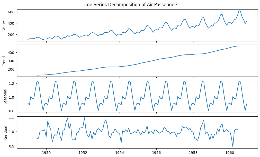
Decomposition#
from statsmodels.tsa.seasonal import seasonal_decompose
passengers = pd.read_csv("data/air_passengers.csv")
passengers.head()
| date | value | |
|---|---|---|
| 0 | 1949-01-01 | 112 |
| 1 | 1949-02-01 | 118 |
| 2 | 1949-03-01 | 132 |
| 3 | 1949-04-01 | 129 |
| 4 | 1949-05-01 | 121 |
date = passengers["date"]
dates = pd.DatetimeIndex(data=date)

passengers = passengers.set_index(dates)

result = seasonal_decompose(passengers["value"], model="multiplicative")
fig, axes = plt.subplots(4, 1, figsize=(10, 6), sharex=True, constrained_layout=True)

ys = (result.observed, result.trend, result.seasonal, result.resid)
ylabels = ("Value", "Trend", "Seasonal", "Residual")

for ax, y, ylabel in zip(axes.flatten(), ys, ylabels):
    ax.plot(dates, y)
    ax.set(ylabel=ylabel)

fig.suptitle("Time Series Decomposition of Air Passengers")
Text(0.5, 0.98, 'Time Series Decomposition of Air Passengers')
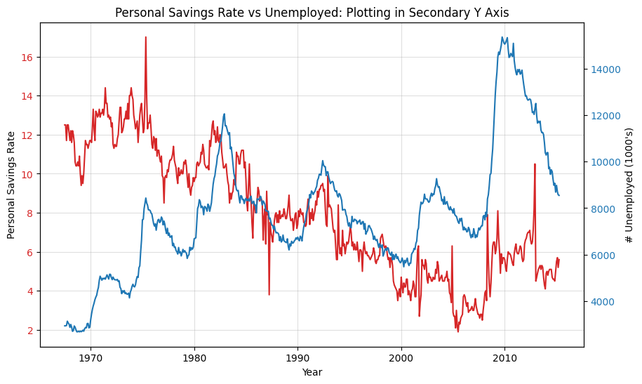
Double Y#
economics = pd.read_csv("data/economics.csv", parse_dates=["date"])
economics.head()
| date | pce | pop | psavert | uempmed | unemploy | |
|---|---|---|---|---|---|---|
| 0 | 1967-07-01 | 507.4 | 198712 | 12.5 | 4.5 | 2944 |
| 1 | 1967-08-01 | 510.5 | 198911 | 12.5 | 4.7 | 2945 |
| 2 | 1967-09-01 | 516.3 | 199113 | 11.7 | 4.6 | 2958 |
| 3 | 1967-10-01 | 512.9 | 199311 | 12.5 | 4.9 | 3143 |
| 4 | 1967-11-01 | 518.1 | 199498 | 12.5 | 4.7 | 3066 |
x = economics["date"]
y1 = economics["psavert"]
y2 = economics["unemploy"]

_, ax = plt.subplots(figsize=(10, 6))
ax.plot(x, y1, color="tab:red")

# Plot Line2 (Right Y Axis)
ax2 = ax.twinx()  # instantiate a second axes that shares the same x-axis
ax2.plot(x, y2, color="tab:blue")

ax.set(xlabel="Year")
ax.tick_params(axis="x", rotation=0)
ax.set(ylabel="Personal Savings Rate")
ax.tick_params(axis="y", rotation=0, labelcolor="tab:red")
ax.grid(alpha=0.4)

ax2.set(ylabel="# Unemployed (1000's)")
ax2.tick_params(axis="y", labelcolor="tab:blue")
ax2.set(title="Personal Savings Rate vs Unemployed: Plotting in Secondary Y Axis")
[Text(0.5, 1.0, 'Personal Savings Rate vs Unemployed: Plotting in Secondary Y Axis')]
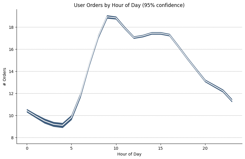
SEM#
from scipy.stats import sem
orders = pd.read_csv("data/user_orders_hourofday.csv")
orders.head()
| user_id | order_hour_of_day | quantity | |
|---|---|---|---|
| 0 | 1 | 7 | 20 |
| 1 | 1 | 8 | 23 |
| 2 | 1 | 9 | 12 |
| 3 | 1 | 12 | 11 |
| 4 | 1 | 14 | 10 |
orders_mean = orders.groupby("order_hour_of_day").quantity.mean()
orders_se = orders.groupby("order_hour_of_day").quantity.apply(sem).mul(1.96)

x = orders_mean.index

fig, ax = plt.subplots(figsize=(10, 6))
ax.set(ylabel="# Orders")
ax.plot(x, orders_mean, color="white", lw=2)
ax.fill_between(x, orders_mean - orders_se, orders_mean + orders_se, color="#3F5D7D")

ax.spines["top"].set_alpha(0)
ax.spines["bottom"].set_alpha(1)
ax.spines["right"].set_alpha(0)
ax.spines["left"].set_alpha(1)
ax.set(title="User Orders by Hour of Day (95% confidence)")
ax.set(xlabel="Hour of Day")

s, e = ax.get_xlim()
ax.set(xlim=(s, e))

for y in range(8, 20, 2):
    ax.hlines(y, xmin=s, xmax=e, colors="black", alpha=0.5, linestyles="--", lw=0.5)
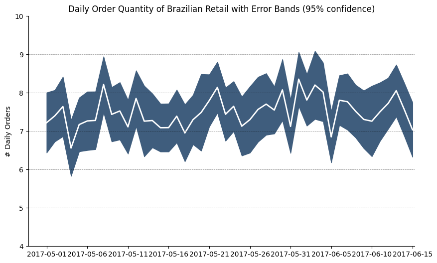
from dateutil.parser import parse
from scipy.stats import sem
orders_45d = pd.read_csv(
    "data/orders_45d.csv", parse_dates=["purchase_time", "purchase_date"]
)
orders_45d.head()
| purchase_time | purchase_date | quantity | |
|---|---|---|---|
| 0 | 2017-05-16 13:10:30 | 2017-05-16 | 5 |
| 1 | 2017-05-16 19:41:10 | 2017-05-16 | 3 |
| 2 | 2017-05-19 18:53:40 | 2017-05-19 | 2 |
| 3 | 2017-05-18 13:55:47 | 2017-05-18 | 1 |
| 4 | 2017-05-14 20:28:25 | 2017-05-14 | 3 |
orders_mean = orders_45d.groupby("purchase_date").quantity.mean()
orders_se = orders_45d.groupby("purchase_date").quantity.apply(sem).mul(1.96)

x = [d.date().strftime("%Y-%m-%d") for d in orders_mean.index]

_, ax = plt.subplots(figsize=(10, 6))

ax.plot(x, orders_mean, color="white", lw=2)
ax.fill_between(x, orders_mean - orders_se, orders_mean + orders_se, color="#3F5D7D")

ax.spines["top"].set_alpha(0)
ax.spines["bottom"].set_alpha(1)
ax.spines["right"].set_alpha(0)
ax.spines["left"].set_alpha(1)

ax.set(ylabel="# Daily Orders")
ax.set_xticks(np.arange(0, len(x), 5))
ax.set(
    title="Daily Order Quantity of Brazilian Retail with Error Bands (95% confidence)"
)

s, e = ax.get_xlim()
ax.set(xlim=(s, e - 2), ylim=(4, 10))

for y in range(5, 10):
    ax.hlines(y, xmin=s, xmax=e, colors="black", alpha=0.5, linestyles="--", lw=0.5)
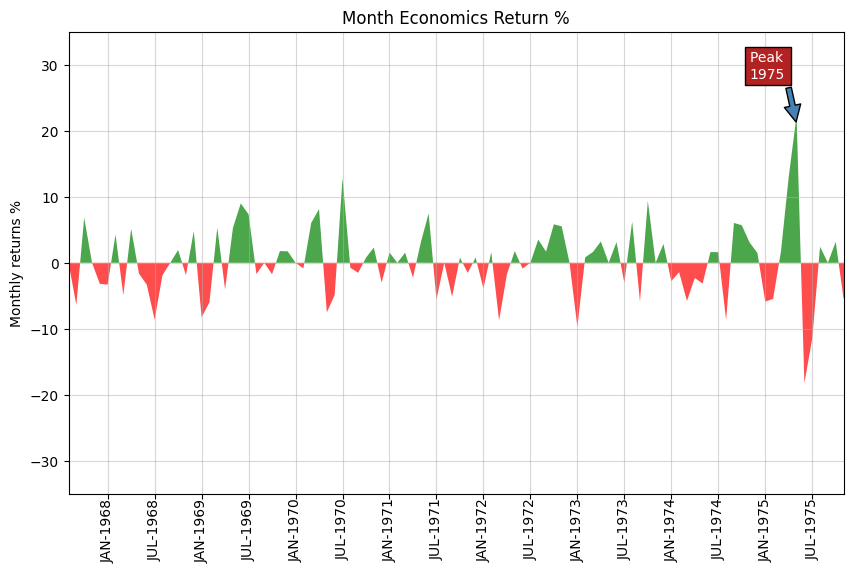
Area#
economics = pd.read_csv("data/economics.csv", parse_dates=["date"])

x = np.arange(economics.shape[0])
y_returns = (economics.psavert.diff().fillna(0) / economics.psavert.shift(1)).fillna(
    0
) * 100

_, ax = plt.subplots(figsize=(10, 6))

ax.fill_between(
    x[1:],
    y_returns[1:],
    0,
    where=y_returns[1:] >= 0,
    facecolor="green",
    interpolate=True,
    alpha=0.7,
)

ax.fill_between(
    x[1:],
    y_returns[1:],
    0,
    where=y_returns[1:] <= 0,
    facecolor="red",
    interpolate=True,
    alpha=0.7,
)

ax.annotate(
    "Peak \n1975",
    xy=(94.0, 21.0),
    xytext=(88.0, 28),
    bbox={"boxstyle": "square", "fc": "firebrick"},
    arrowprops={"facecolor": "steelblue", "shrink": 0.05},
    fontsize="medium",
    color="white",
)

xtickvals = [
    f"{str(m)[:3].upper()}-{y!s}"
    for y, m in zip(economics.date.dt.year, economics.date.dt.month_name())
]

ax.set_xticks(x[::6])
ax.set_xticklabels(
    xtickvals[::6],
    rotation=90,
    fontdict={"horizontalalignment": "center", "verticalalignment": "center_baseline"},
)
ax.set(
    xlim=(1, 100),
    ylim=(-35, 35),
    title="Month Economics Return %",
    ylabel="Monthly returns %",
)
ax.grid(alpha=0.5)
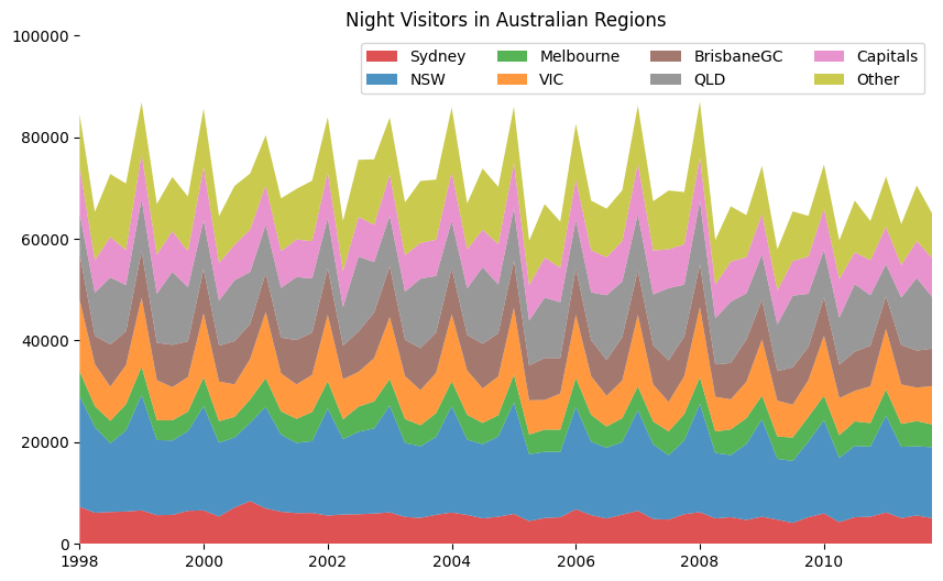
Stacked Area#
visitors = pd.read_csv("data/night_visitors.csv", parse_dates=["yearmon"])
visitors.head()
/tmp/ipykernel_2662/1439259366.py:1: UserWarning: Could not infer format, so each element will be parsed individually, falling back to `dateutil`. To ensure parsing is consistent and as-expected, please specify a format.
  visitors = pd.read_csv("data/night_visitors.csv", parse_dates=["yearmon"])
| yearmon | Sydney | NSW | Melbourne | VIC | BrisbaneGC | QLD | Capitals | Other | |
|---|---|---|---|---|---|---|---|---|---|
| 0 | 1998-01-01 | 7320 | 21782 | 4865 | 14054 | 9055 | 8016 | 9178 | 10232 |
| 1 | 1998-04-01 | 6117 | 16881 | 4100 | 8237 | 5616 | 8461 | 6362 | 9540 |
| 2 | 1998-07-01 | 6282 | 13495 | 4418 | 6731 | 8298 | 13175 | 7965 | 12385 |
| 3 | 1998-10-01 | 6368 | 15963 | 5157 | 7675 | 6674 | 9092 | 6864 | 13098 |
| 4 | 1999-01-01 | 6602 | 22718 | 5550 | 13581 | 9168 | 10224 | 8908 | 10140 |
mycolors = [
    "tab:red",
    "tab:blue",
    "tab:green",
    "tab:orange",
    "tab:brown",
    "tab:grey",
    "tab:pink",
    "tab:olive",
]

columns = visitors.columns[1:]
labs = columns.array.tolist()

x = visitors["yearmon"].array.tolist()

ys = []

for i in range(8):
    yi = visitors[columns[i]].array.tolist()
    ys.append(yi)

y = np.vstack(ys)

labs = columns.array.tolist()

_, ax = plt.subplots(figsize=(10, 6))

ax.stackplot(x, y, labels=labs, colors=mycolors, alpha=0.8)

ax.set(ylim=[0, 100000], title="Night Visitors in Australian Regions")
ax.set(xlim=(x[0], x[-1]))
ax.spines[["right", "top", "left", "bottom"]].set_visible(False)
ax.legend(ncol=4)
plt.setp(ax.get_xticklabels()[::5], horizontalalignment="center")
plt.setp(ax.get_yticklabels()[::5], horizontalalignment="right")
[None, None]
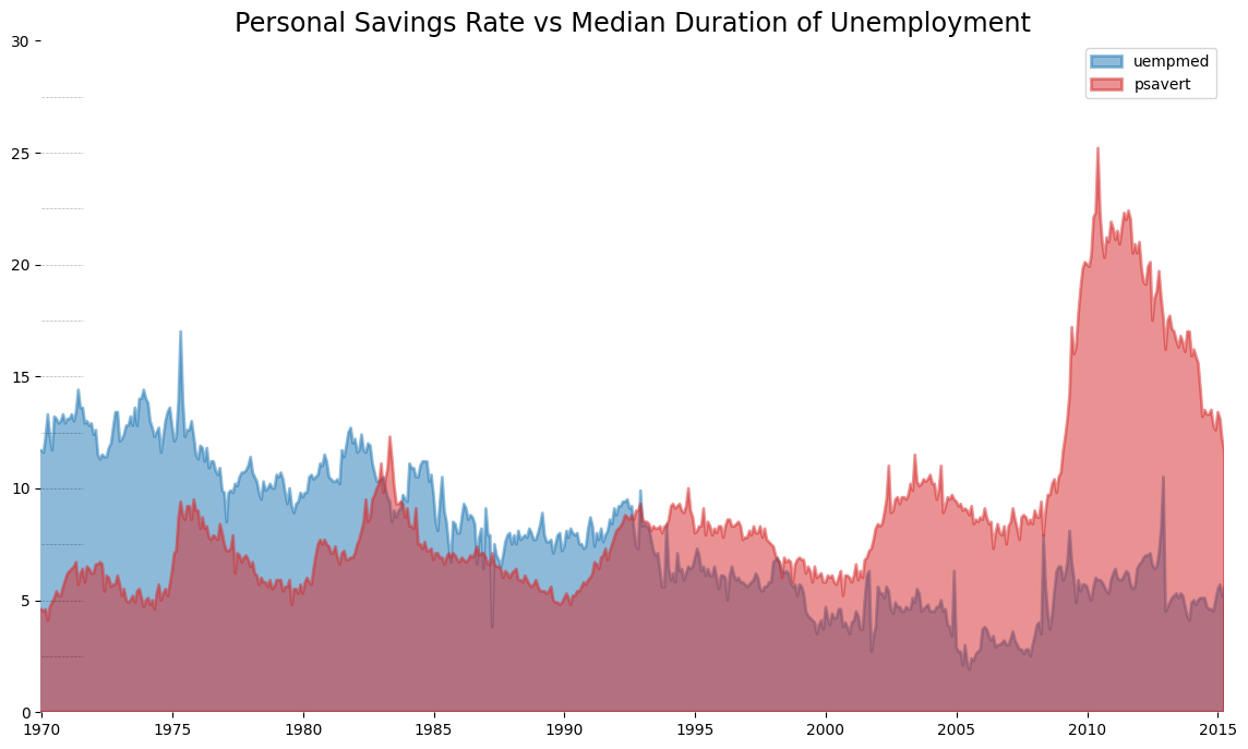
Unstacked Area#
x = economics["date"].array.tolist()
y1 = economics["psavert"].array.tolist()
y2 = economics["uempmed"].array.tolist()
mycolors = [
    "tab:red",
    "tab:blue",
    "tab:green",
    "tab:orange",
    "tab:brown",
    "tab:grey",
    "tab:pink",
    "tab:olive",
]
columns = ["psavert", "uempmed"]

fig, ax = plt.subplots(1, 1, figsize=(14, 8))
ax.fill_between(x, y1=y1, y2=0, label=columns[1], alpha=0.5, color=mycolors[1], lw=2)
ax.fill_between(x, y1=y2, y2=0, label=columns[0], alpha=0.5, color=mycolors[0], lw=2)

ax.set(xlim=(-10, x[-1]), ylim=[0, 30])

ax.set_title(
    "Personal Savings Rate vs Median Duration of Unemployment", fontsize="xx-large"
)


ax.legend(loc="best")
plt.setp(ax.get_xticklabels()[::50], horizontalalignment="center")
plt.setp(ax.get_yticklabels()[::50], horizontalalignment="right")

for y in np.arange(2.5, 30.0, 2.5):
    ax.hlines(
        y, xmin=0, xmax=len(x), colors="black", alpha=0.3, linestyles="--", lw=0.5
    )

ax.spines[["right", "top", "left", "bottom"]].set_visible(False)