分布#
import numpy as np
import pandas as pd
from plotnine import *
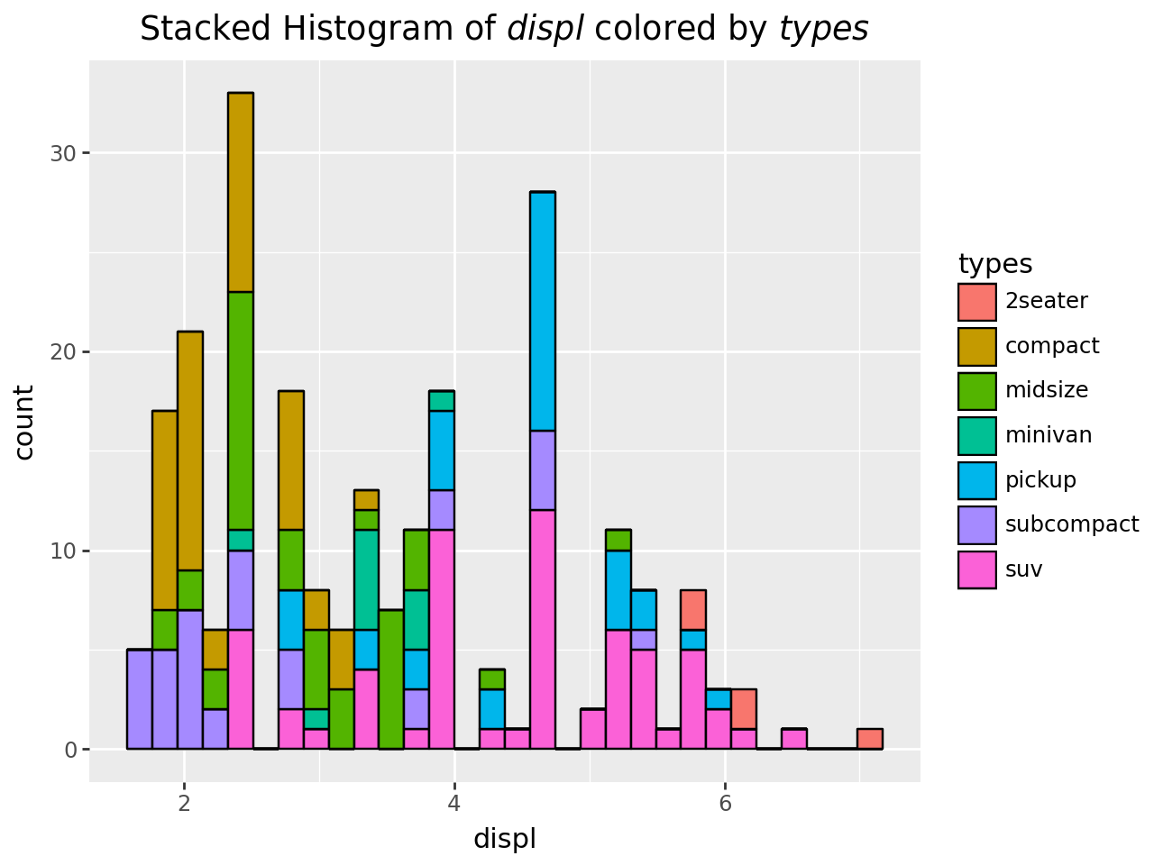
Stacked Histogram#
mpg = pd.read_csv("data/mpg.csv")
mpg = mpg.rename(columns={"class": "types"})
mpg.head()
| manufacturer | model | displ | year | cyl | trans | drv | cty | hwy | fl | types | |
|---|---|---|---|---|---|---|---|---|---|---|---|
| 0 | audi | a4 | 1.8 | 1999 | 4 | auto(l5) | f | 18 | 29 | p | compact |
| 1 | audi | a4 | 1.8 | 1999 | 4 | manual(m5) | f | 21 | 29 | p | compact |
| 2 | audi | a4 | 2.0 | 2008 | 4 | manual(m6) | f | 20 | 31 | p | compact |
| 3 | audi | a4 | 2.0 | 2008 | 4 | auto(av) | f | 21 | 30 | p | compact |
| 4 | audi | a4 | 2.8 | 1999 | 6 | auto(l5) | f | 16 | 26 | p | compact |
x_var, group_var = "displ", "types"

(
    ggplot(mpg, aes("displ", fill="types"))
    + geom_histogram(bins=30, color="black")
    + labs(title=f"Stacked Histogram of ${x_var}$ colored by ${group_var}$")
)
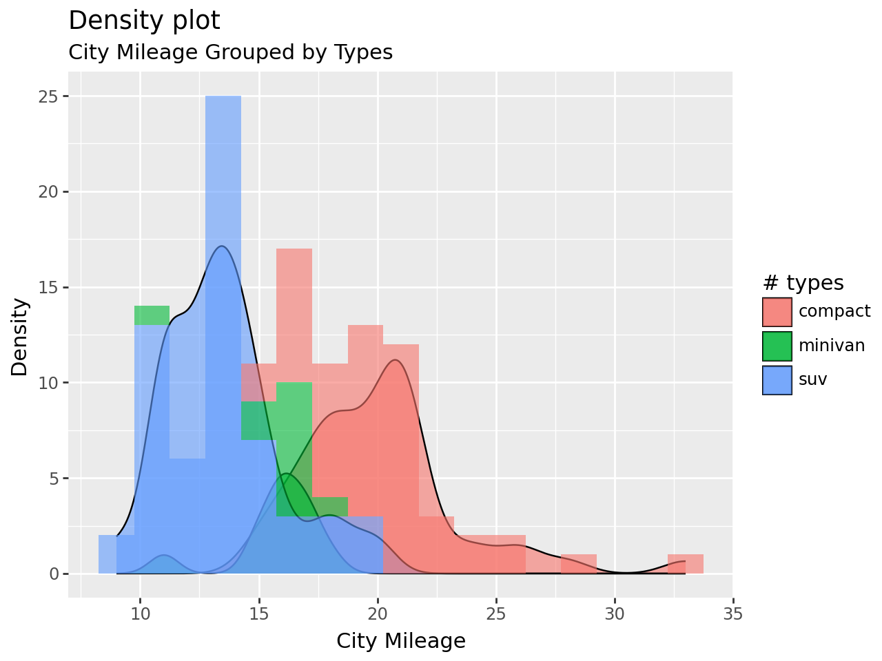
Density#
mpg_selected = mpg.query("types in ['compact', 'suv', 'minivan']")
binwidth = 1.5

(
    ggplot(mpg_selected, aes("cty", fill="types"))
    + geom_density(aes(y=after_stat("count*binwidth")), alpha=0.6)
    + geom_histogram(
        aes(fill="types", y=after_stat("count")),
        binwidth=binwidth,
        color="none",
        alpha=0.6,
    )
    + labs(
        title="Density plot",
        subtitle="City Mileage Grouped by Types",
        x="City Mileage",
        y="Density",
        fill="# types",
    )
)
Box#
(
    ggplot(mpg, aes("types", "hwy"))
    + geom_boxplot(aes(fill="types"), notch=False)
    + labs(
        title="Box plot",
        subtitle="City Mileage grouped by Class of vehicle",
        x="Class of Vehicle",
        y="City Mileage",
    )
)
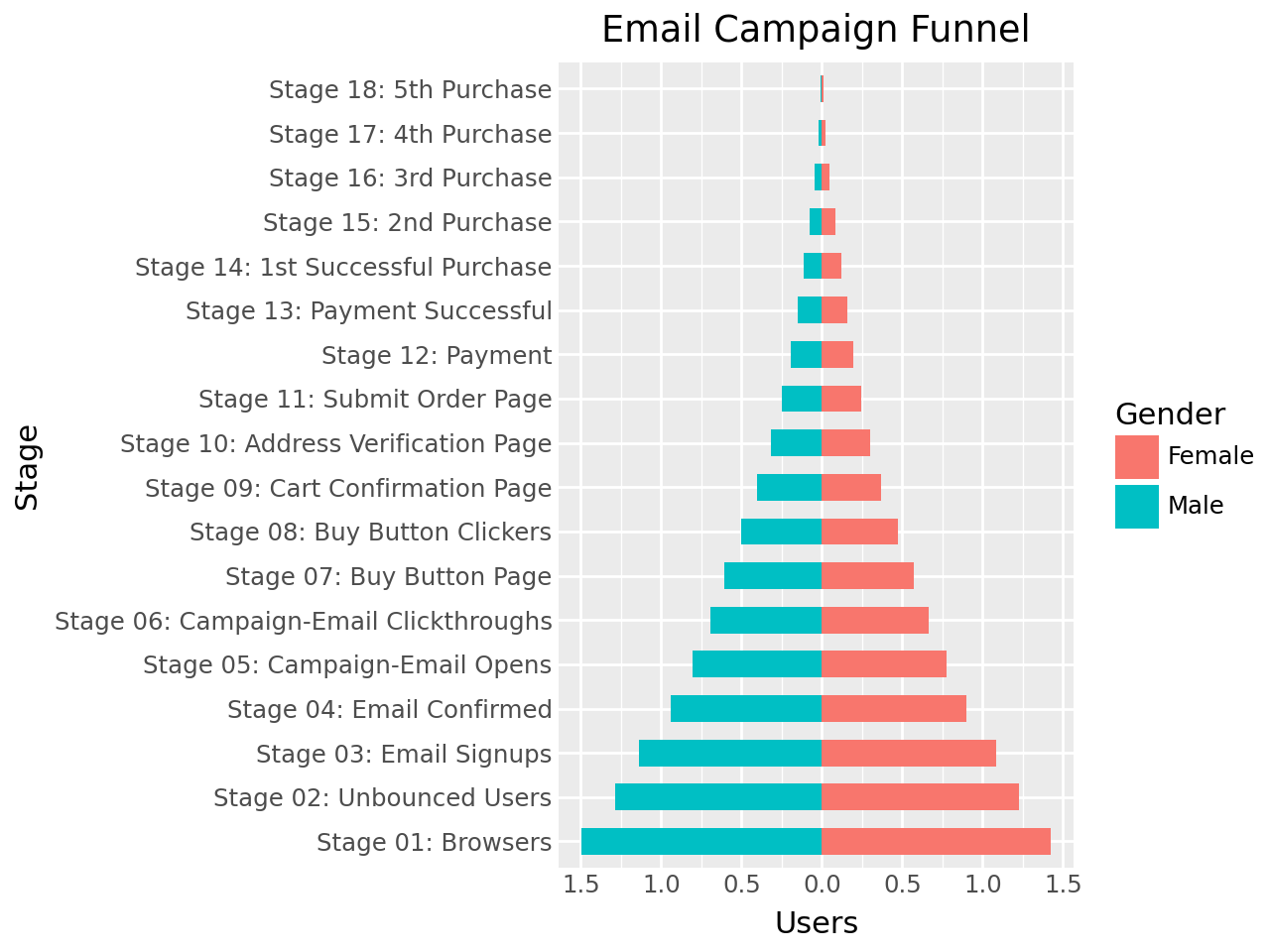
Pyramid#
email = pd.read_csv("data/email_campaign_funnel.csv")
email.head()
| Stage | Gender | Users | |
|---|---|---|---|
| 0 | Stage 01: Browsers | Male | -1.492762e+07 |
| 1 | Stage 02: Unbounced Users | Male | -1.286266e+07 |
| 2 | Stage 03: Email Signups | Male | -1.136190e+07 |
| 3 | Stage 04: Email Confirmed | Male | -9.411708e+06 |
| 4 | Stage 05: Campaign-Email Opens | Male | -8.074317e+06 |
(
    ggplot(email, aes(x="Stage", y="Users", fill="Gender"))
    + geom_bar(stat="identity", width=0.6)  # Fill column
    + scale_y_continuous(
        breaks=np.arange(-1.5e7, 2e7, 5e6),  # ty:ignore[invalid-argument-type]
        labels=[*np.arange(1.5, 0, -0.5), *np.arange(0, 2, 0.5)],
    )
    + coord_flip()
    + labs(title="Email Campaign Funnel")
    + theme(plot_title=element_text(hjust=0.5), axis_ticks=element_blank())
)