占比#
import matplotlib.pyplot as plt
import numpy as np
import pandas as pd
mpg = pd.read_csv("data/mpg.csv")
mpg.head()
| manufacturer | model | displ | year | cyl | trans | drv | cty | hwy | fl | class | |
|---|---|---|---|---|---|---|---|---|---|---|---|
| 0 | audi | a4 | 1.8 | 1999 | 4 | auto(l5) | f | 18 | 29 | p | compact |
| 1 | audi | a4 | 1.8 | 1999 | 4 | manual(m5) | f | 21 | 29 | p | compact |
| 2 | audi | a4 | 2.0 | 2008 | 4 | manual(m6) | f | 20 | 31 | p | compact |
| 3 | audi | a4 | 2.0 | 2008 | 4 | auto(av) | f | 21 | 30 | p | compact |
| 4 | audi | a4 | 2.8 | 1999 | 6 | auto(l5) | f | 16 | 26 | p | compact |
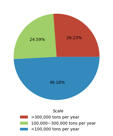
Simple Pie Chart#
data = {
    "Scale": [
        ">300,000 tons per year",
        "100,000~300,000 tons per year",
        "<100,000 tons per year",
    ],
    "Proportion": ["0.2623", "0.2459", "0.4918"],
}

df = pd.DataFrame(data)
df.head()
| Scale | Proportion | |
|---|---|---|
| 0 | >300,000 tons per year | 0.2623 |
| 1 | 100,000~300,000 tons per year | 0.2459 |
| 2 | <100,000 tons per year | 0.4918 |
plt.pie(df.Proportion, colors=["#bd4634", "#7fbd34bd", "#348ABD"], autopct="%.2f%%")

plt.legend(
    df.Scale, title="Scale", bbox_to_anchor=(0.5, -0.45, 0.4, 0.5), frameon=False
)
<matplotlib.legend.Legend at 0x7ff1aa296cf0>
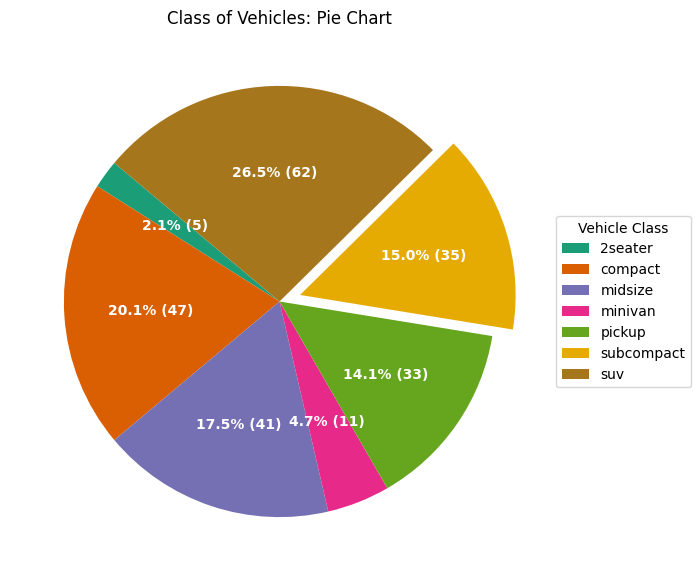
Pie Chart with Convex#
mpg_group = mpg.groupby("class").size().reset_index(name="counts")  # ty:ignore[no-matching-overload]

_, ax = plt.subplots(figsize=(12, 7), subplot_kw={"aspect": "equal"})

data = mpg_group["counts"]
categories = mpg_group["class"]
explode = [0, 0, 0, 0, 0, 0.1, 0]


def func(pct, allvals) -> str:
    absolute = int(pct / 100.0 * np.sum(allvals))
    return f"{pct:.1f}% ({absolute})"


wedges, texts, autotexts = ax.pie(  # ty:ignore[invalid-assignment]
    data,
    autopct=lambda pct: func(pct, data),
    textprops={"color": "w"},
    colors=plt.cm.Dark2.colors,  # ty:ignore[unresolved-attribute]
    startangle=140,
    explode=explode,
)

ax.legend(
    wedges,
    categories,
    title="Vehicle Class",
    loc="center left",
    bbox_to_anchor=(1, 0, 0.5, 1),
)
plt.setp(autotexts, size=10, weight=700)
ax.set(title="Class of Vehicles: Pie Chart")
[Text(0.5, 1.0, 'Class of Vehicles: Pie Chart')]
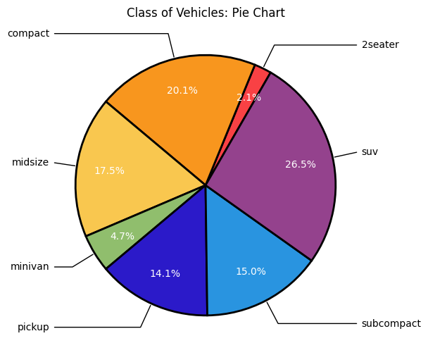
Pie Chart with Wedges#
colors = ["#f94144", "#f8961e", "#f9c74f", "#90be6d", "#2b1ac9", "#2994e0", "#94428d"]
wedgeprops = {
    "edgecolor": "k",
    "linewidth": 2,
    "linestyle": "solid",
    "antialiased": True,
}

categories = mpg_group["class"]
data = mpg_group["counts"]

_, ax = plt.subplots(figsize=(6, 6), subplot_kw={"aspect": "equal"})

wedges, texts, autotexts = ax.pie(  # ty:ignore[invalid-assignment]
    data,
    colors=colors,
    autopct="%1.1f%%",
    startangle=60,
    pctdistance=0.75,
    wedgeprops=wedgeprops,
    textprops={"fontsize": 10, "color": "white"},
)

ax.set(title="Class of Vehicles: Pie Chart")
bbox_props = {"boxstyle": "square, pad=0.3", "fc": "w", "ec": "w", "lw": 0.5}

kw = {
    "arrowprops": {"arrowstyle": "-"},
    "bbox": bbox_props,
    "zorder": 0,
    "va": "center",
}

for k, p in enumerate(wedges):
    ang = (p.theta2 - p.theta1) / 2.0 + p.theta1
    y = np.sin(np.deg2rad(ang))
    x = np.cos(np.deg2rad(ang))
    horizontalalignment = {-1: "right", 1: "left"}[int(np.sign(x))]
    connectionstyle = f"angle, angleA=0, angleB={ang}"
    kw["arrowprops"].update({"connectionstyle": connectionstyle})
    ax.annotate(
        categories[k],
        xy=(x, y),
        xytext=(1.2 * np.sign(x), 1.2 * y),
        horizontalalignment=horizontalalignment,
        **kw,  # ty:ignore[invalid-argument-type]
    )