排序#
import matplotlib.pyplot as plt
import numpy as np
import pandas as pd
from plotnine import *
Lollipop#
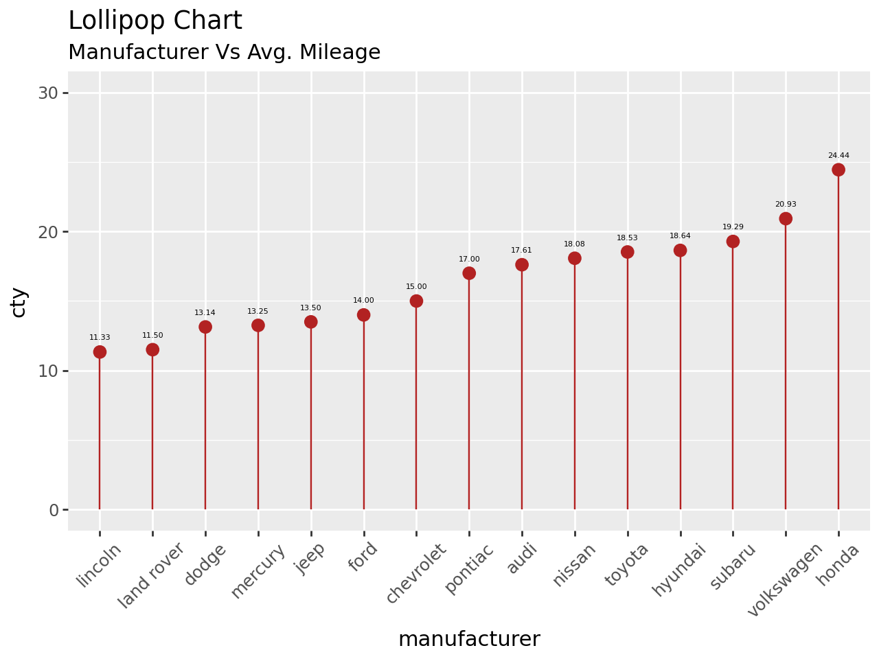
mpg = pd.read_csv("data/mpg.csv")
mpg.head()
| manufacturer | model | displ | year | cyl | trans | drv | cty | hwy | fl | class | |
|---|---|---|---|---|---|---|---|---|---|---|---|
| 0 | audi | a4 | 1.8 | 1999 | 4 | auto(l5) | f | 18 | 29 | p | compact |
| 1 | audi | a4 | 1.8 | 1999 | 4 | manual(m5) | f | 21 | 29 | p | compact |
| 2 | audi | a4 | 2.0 | 2008 | 4 | manual(m6) | f | 20 | 31 | p | compact |
| 3 | audi | a4 | 2.0 | 2008 | 4 | auto(av) | f | 21 | 30 | p | compact |
| 4 | audi | a4 | 2.8 | 1999 | 6 | auto(l5) | f | 16 | 26 | p | compact |
mpg_group = mpg.loc[:, ["cty", "manufacturer"]].groupby("manufacturer").mean()
mpg_group.head()
mpg_group.head()
| cty | |
|---|---|
| manufacturer | |
| audi | 17.611111 |
| chevrolet | 15.000000 |
| dodge | 13.135135 |
| ford | 14.000000 |
| honda | 24.444444 |
mpg_group = mpg_group.sort_values("cty")
mpg_group = mpg_group.reset_index()
mpg_group.head()
| manufacturer | cty | |
|---|---|---|
| 0 | lincoln | 11.333333 |
| 1 | land rover | 11.500000 |
| 2 | dodge | 13.135135 |
| 3 | mercury | 13.250000 |
| 4 | jeep | 13.500000 |
(
    ggplot(mpg_group, aes(x="manufacturer", y="cty", label="cty"))
    + geom_point(size=3, color="firebrick")
    + geom_segment(
        aes(x="manufacturer", xend="manufacturer", y=0, yend="cty"), color="firebrick"
    )
    + geom_text(color="black", size=4, nudge_y=1, format_string="{:.2f}")
    + labs(title="Lollipop Chart", subtitle="Manufacturer Vs Avg. Mileage")
    + scale_x_discrete(limits=mpg_group.manufacturer)
    + theme(axis_text_x=element_text(angle=45, vjust=1))
    + ylim(0, 30)
)
Slope#
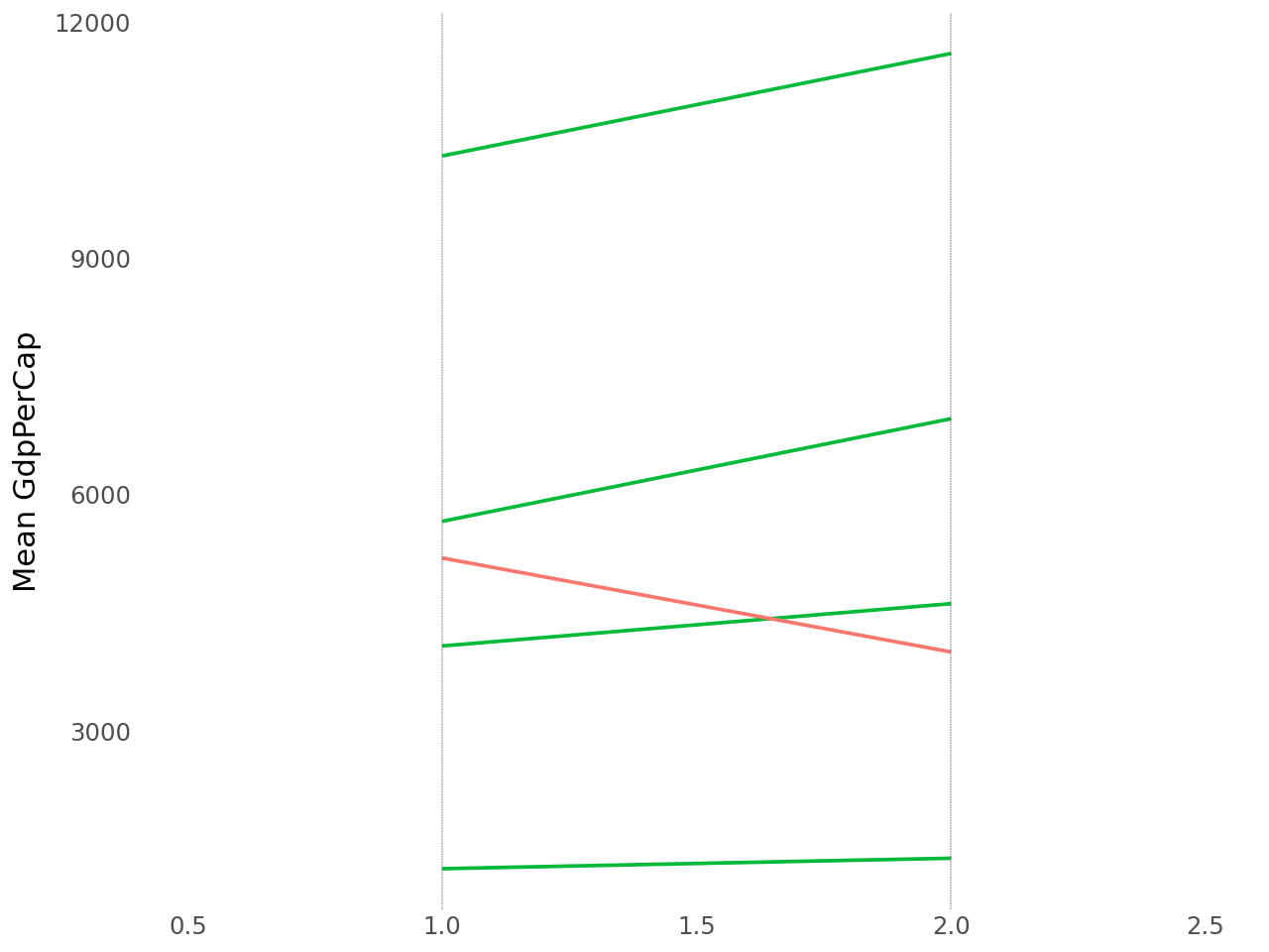
gdp = pd.read_csv("data/gdp_per_cap.csv")
gdp.head()
| continent | 1952 | 1957 | |
|---|---|---|---|
| 0 | Africa | 1252.572466 | 1385.236062 |
| 1 | Americas | 4079.062552 | 4616.043733 |
| 2 | Asia | 5195.484004 | 4003.132940 |
| 3 | Europe | 5661.057435 | 6963.012816 |
| 4 | Oceania | 10298.085650 | 11598.522455 |
gdp_new = gdp.melt(
    id_vars=["continent"],
    value_vars=["1952", "1957"],
    var_name="time",
    value_name="total",
    ignore_index=False,
)
gdp_new["continent"] = gdp_new["continent"].astype("category")
gdp_new
| continent | time | total | |
|---|---|---|---|
| 0 | Africa | 1952 | 1252.572466 |
| 1 | Americas | 1952 | 4079.062552 |
| 2 | Asia | 1952 | 5195.484004 |
| 3 | Europe | 1952 | 5661.057435 |
| 4 | Oceania | 1952 | 10298.085650 |
| 0 | Africa | 1957 | 1385.236062 |
| 1 | Americas | 1957 | 4616.043733 |
| 2 | Asia | 1957 | 4003.132940 |
| 3 | Europe | 1957 | 6963.012816 |
| 4 | Oceania | 1957 | 11598.522455 |
_, ax = plt.subplots(figsize=(10, 5))

gdp_new.groupby("continent").plot.line(x="time", y="total", ax=ax)

for i in [0, 1]:
    ax.vlines(
        x=i,
        ymin=gdp_new["total"].min(),
        ymax=gdp_new["total"].max(),
        colors="k",
        linestyle="dotted",
    )

ax.set(
    xlabel="Time",
    ylabel="Mean GDP Per Capita",
    title="Slopechart: Comparing GDP Per Capita between 1952 vs 1957\n",
    xticks=[0, 1],
    xticklabels=["1952", "1957"],
)

ax.spines[["right", "top", "left"]].set_visible(False)

ax.legend(
    gdp_new["continent"].unique(),
    loc="center",
    bbox_to_anchor=(0.5, 1),
    ncol=len(gdp_new["continent"].unique()),
    fontsize="small",
)
<matplotlib.legend.Legend at 0x7f64d1449550>
gdp["class"] = np.where(gdp["1957"] - gdp["1952"] < 0, "red", "green")
p = (
    ggplot(gdp)
    + geom_segment(aes(x=1, xend=2, y="1952", yend="1957", color="class"), size=0.75)
    + geom_vline(xintercept=1, linetype="dashed", size=0.1)
    + geom_vline(xintercept=2, linetype="dashed", size=0.1)
    + scale_color_manual(
        labels=["Up", "Down"], values={"green": "#00ba38", "red": "#f8766d"}
    )
    + labs(x="", y="Mean GdpPerCap")
    + xlim(0.5, 2.5)
    + theme(
        panel_background=element_blank(),
        panel_grid=element_blank(),
        axis_ticks=element_blank(),
        # axis_text_x=element_blank(),
        panel_border=element_blank(),
        legend_position="none",
    )
)

p